E-Design: D.C. Living Room
Interior design can enhance your quality of life in so many ways. Before you jump in to this journey of celebrating your environment, where do you start? We were recently approached by a client located in Washington D.C. to design their future living room. Their requests entailed:
Utilizing as much of the linear space as possible since the room was long and narrow
Incorporating neutral-colored performance fabrics for future little ones, and
Creating an overall feeling that was serene, sophisticated, welcoming, and European as some of their favorite travels together had previously been in Paris, France.
Establishing a furniture floor plan that centered around the existing television location on the far wall, but maintained balance with the overall volume of space embodied in the room. It was also critical to maintaining a clear walking path from the entry to the back of the house which included the dining room and kitchen.
Keeping these points in mind, our team quickly reflected on the vision and questionnaire response we had received. We send these questionnaires to all of our new e-design clients, and after mulling over their requests and imagining their vision for their new living room, we quickly got to work.
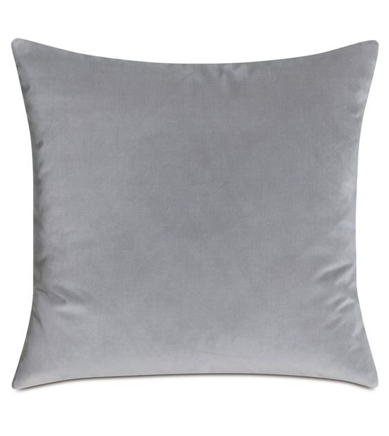
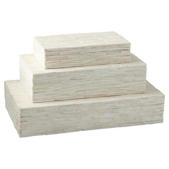
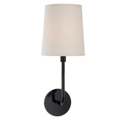
The image above is the overall vision we created for this couple’s new home; a soft color palette, touches of black to blend with the contemporary architecture of their new living room, rounded edges to channel current European upholstery, and ample seating to accommodate visitors while entertaining.
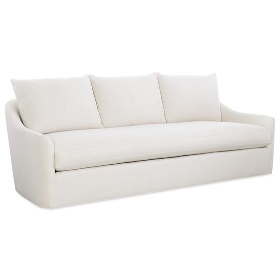
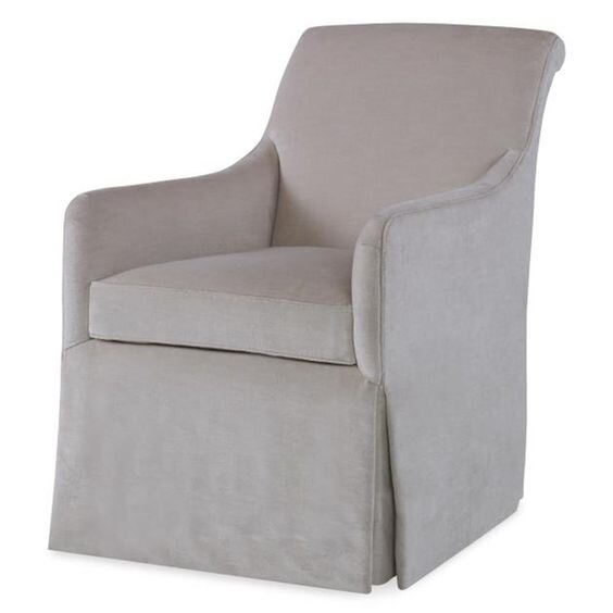
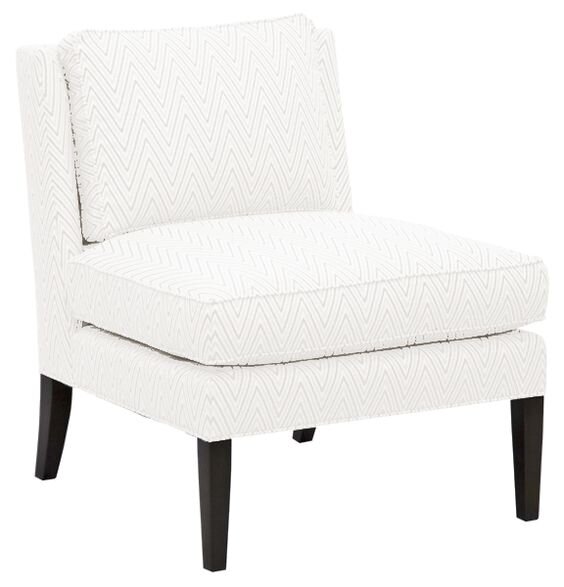
Our first order of business when working on the space planning was to establish a furniture layout that maintained the walking path requested by the client from the front door to the back of the house but also centered around the TV. With those requirements, we decided to position the sofa opposite the TV wall, but we selected something that had soft rounded edges, and a rounded back so that upon entering the room, the space didn’t feel as closed off as it would have with a more traditional, geometric sofa. We laid out two chairs with higher backs near the bay window to further accentuate the height of that side of the room. Then we placed two other slipper chairs opposite the bay window. By flanking the sofa with two sets of chairs, it not only works to keep the line of visibility open from one side of the room to the other but also maintains an open volume of space. The layout will naturally encourage guests to continue their journey to the back of the house. When considering the floor plan and layout of a living room, it is important to identify a couple of factors.
The Function and Purpose of The Room
Is the function and purpose to rest at the end of a long day while watching Netflix or a movie on the sofa? Or does it act as a more formal sitting area that will mostly be used for entertaining when hosting guests or parties? We often recommend to our clients while walking them through the floor plan that you want to think about the vignettes or snapshots that someone will experience while entering, residing, and exiting in the room. For this space - the moment upon entry to the house was everything.
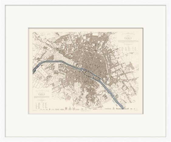
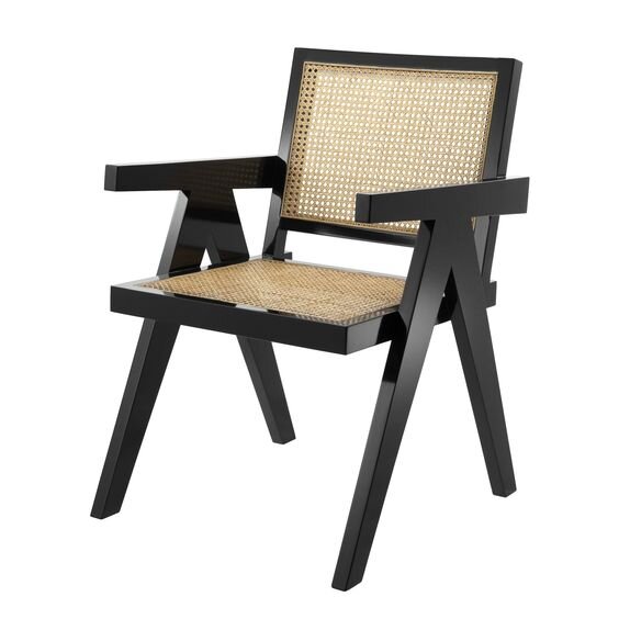
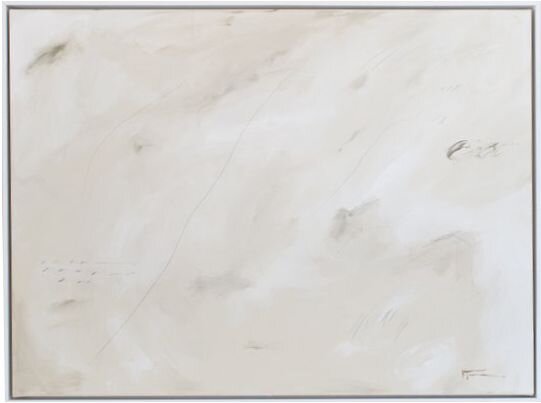
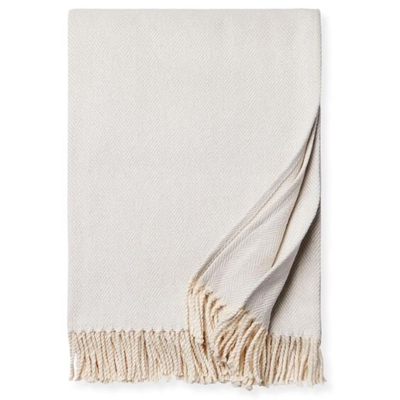
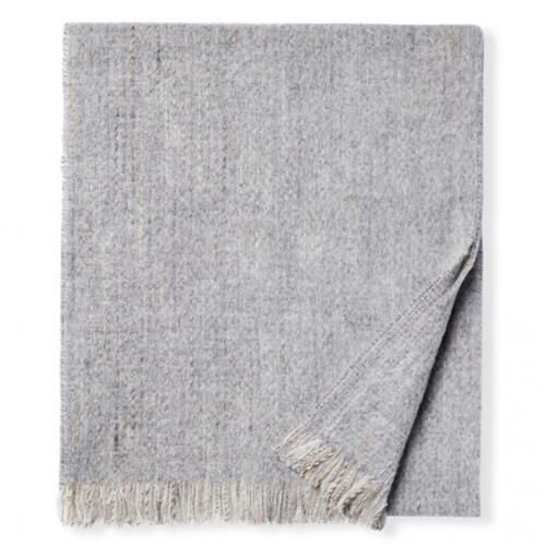
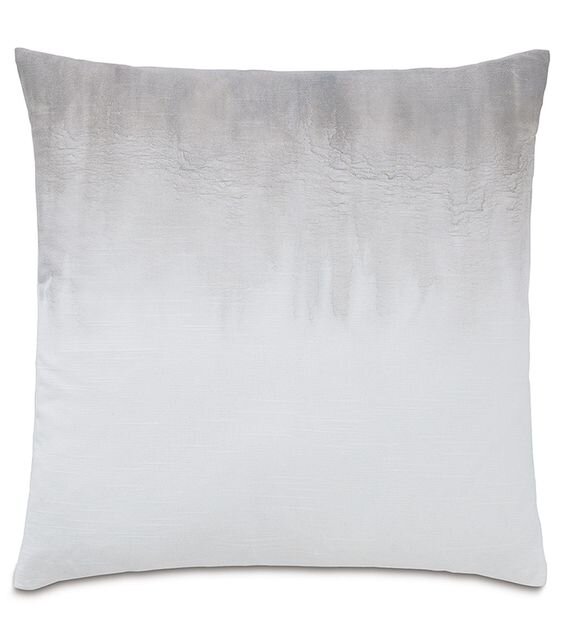
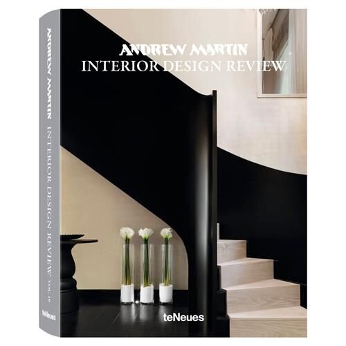
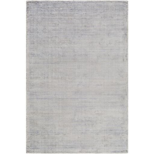
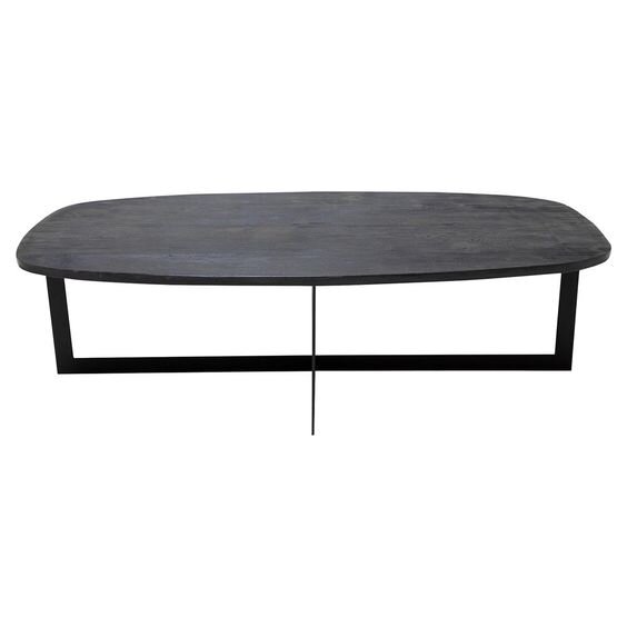
To round out the design we selected a supplementary accent chair in a black lacquer and rattan finish (per the client’s request) and a larger faux potted fiddle leaf tree to be layered in behind the two slipper chairs, thus creating a secondary layer of color and interest towards the back of the narrow room. The scale and size of the faux plant visually added interest along the back wall, and also served to balance the drapery at that back window which provided the appearance of increased height in the space. We included a large area rug in a complementary gray tone to not only ground the main furniture arrangement in the space but to also help tie in all of the decorative pillows, throws and coffee table books. Lastly, we added a special artwork showcasing a map of Paris on the wall space between the TV console and back window to add visual balance and give a nod to the unique story of the couple we were designing for. With a touch of flowers, some good coffee table books and a candle atop the coffee table, voila! Design complete.
Why performance fabrics make all the difference
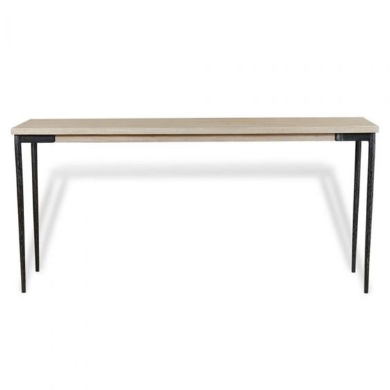
A few other important things to note about this design are that all of the selected upholstered pieces were specified with performance-rated fabric (Crypton is a favorite of ours). It was important for this client that the pieces they were investing in were not only going to look clean and fresh the first few weeks but also in the next 5 years once babies were welcomed into their growing family. We extended this notion behind the selected area rug as well and chose something that was also performance rated with a poly-blend weave. Lastly, to provide future storage for toys and books, we selected a higher console so that baskets could be nested underneath to keep the space clean and picked up at the end of full days worth of toddler play.
We would love the opportunity to design your next space whether you are local to the Florida area, or across the nation in California. We are currently accepting clients for our e-design services and would welcome the opportunity to schedule a call and discuss our package deals to see which would be a good fit for your needs. Whether you are working from home and need to convert your existing guest bedroom into a home office, or if you’re in need of better storage solutions while living and working with babies, or just needing a new update now that you are spending most of your time at home, we encourage you to feel free and reach out to our team at info@akco.design.
We look forward to connecting with you!
Happy Friday friends!


