Our Latest Living Room Design in Serene Shades of Blue
December is here and has me thinking of the song Summertime Sadness by Lana Del Ray, as the weather turns cooler and the skies a bit grayer. One of my close friends back in NYC recently shared a video of the first snowfall of the season. This has me thinking that it would be fun to reminisce on the big apple and feature a recent living room project for a client located in NYC proper. Their requests entailed:
Providing a living room refresh that blended classic style with a modern twist. The living room had to offer performance-friendly upholstery that was soft to the touch with a pop of color.
We explored how to maximize the layout to accommodate guests who may come to visit for the holidays (or propose furniture that brought comfortable seating for those after dinner Netflix binge sessions we all know far too well!)
Another point was to establish a furniture floor plan that complemented the dining room design we were developing in the other half of the room. We would need to create some form of separation to clearly distinguish and define each space.
Layering in artwork, lighting, and accessories that tied the room together would also need to offer a sense of softness, serenity, and peace of mind to the end of a long, hard workday.
With these design pillars in mind, our team was able to quickly analyze and formulate a strategy that aligned with the client’s questionnaire responses and we were off to the races.
I’M BLUE
The image above is the overall vision we created for this clients’ new living room space. Our focus was centered around a soft color palette with touches of blue to complement the clients’ recently updated master bedroom. This setting features sprinkles of brass mixed with natural wood tones, textures, ample seating, and surface area to accommodate visitors while entertaining.
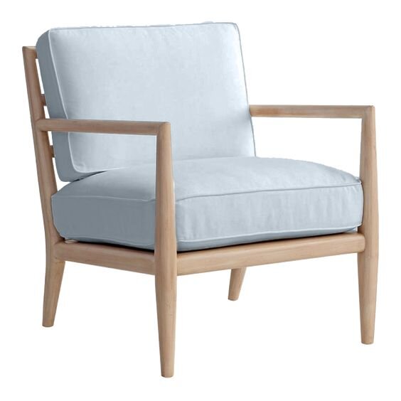
There were two important architectural elements in this room that the furniture arrangement needed to be centered around. There are two free-standing columns between the living and dining area, and a large built-in where the TV was nested across from the sofa. As with most homes in NYC, the living room also included a radiator which we needed to design around. With those requirements, we decided to locate the larger sofa opposite the TV wall for the most optimal viewing. We paired two wooden accent chairs with their backs facing the dining area to maintain sightline into the space and to provide visual geometry framing out the loveseat and window treatments further back in that sightline. A fun tip that we like to share with our clients, we not only love locating a set of two accent chairs on the outer edge of a room because it visually welcomes guests into a space without making the layout feel closed off, but it allows the back detail of the chair to be seen from other areas of the room. We are very intentional about the pieces of furniture we specify and the affiliated details which add value to the design!
WHAT’S YOUR FUNCTION?
We know it’s been said already a few times on our blog posts, but when considering the floor plan and layout of a living room, it is most important to identify the function and purpose of the room, and what that entry vignette will look like for guests. For more reasoning on why that’s important, look back at our earlier blog post here.
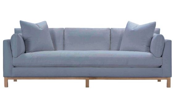
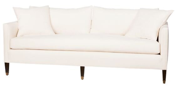
Once we had the layout locked in, we switched gears to specify each upholstered piece and its fabric. The main sofa resting against the back wall is the main feature in this room not only because the shape and leg detail is elegant and refined, but also because we decided to break up a traditional white painted wall with a strong blue upholstery color. This fabric in particular has got to be one of the softest performance fabrics I’ve specified to date (so soft that my husband even made a note when the sample arrived in the mail!). We decided to pick up that blue tone with a softer lighter blue fabric on the accent chairs (courtesy of Perennials). The fabric on the custom loveseat opposite the chairs is also a white textured fabric by Perennials. If you can’t already tell, Perennials is another one of our favorite go-to’s when clients ask for performance fabrics. I’m sure most of you are now asking why, but we’ll have to save that for another post because it deserves a lengthy response. To round out the design of each furniture selection we made sure to define bench seat cushions on both sofas. It offers a more contemporary shape, and also mitigates the repetitive nature of individual seat cushions.
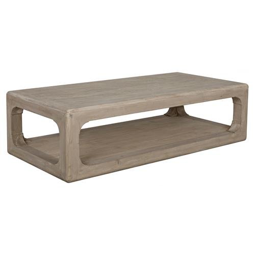
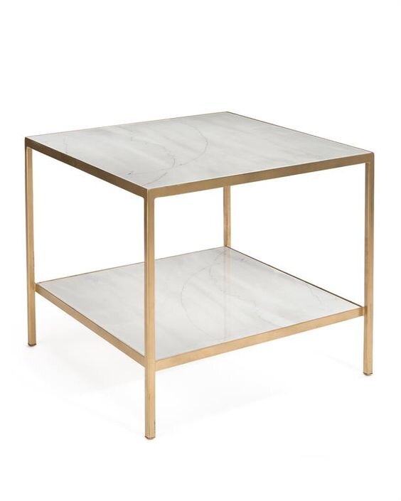
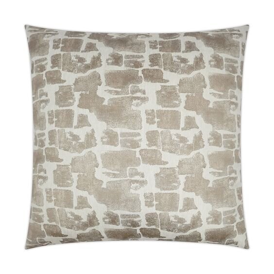
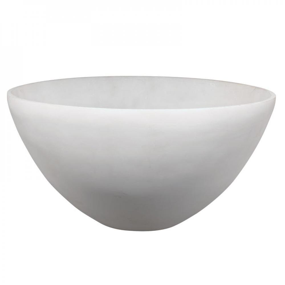
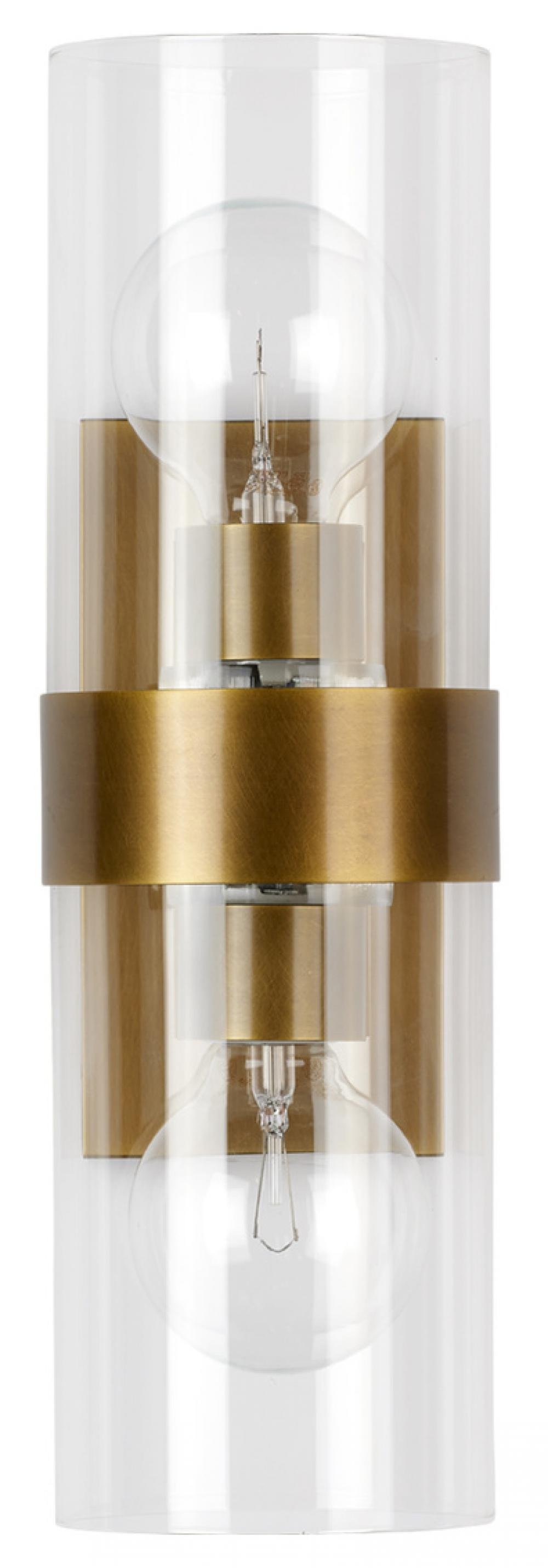
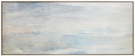
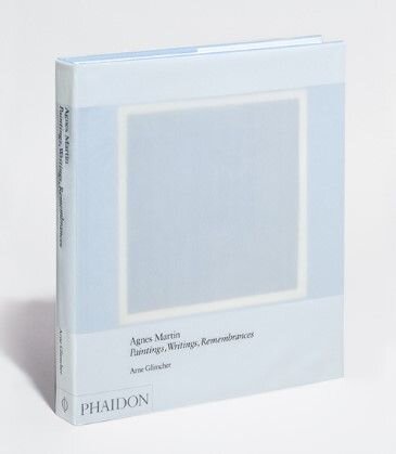
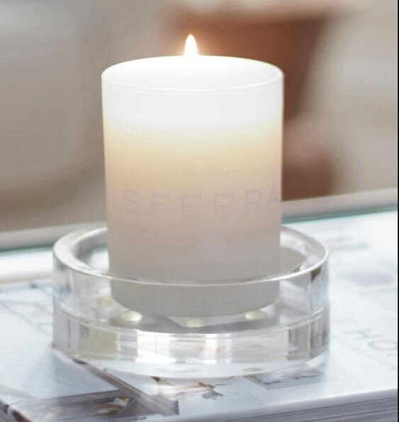
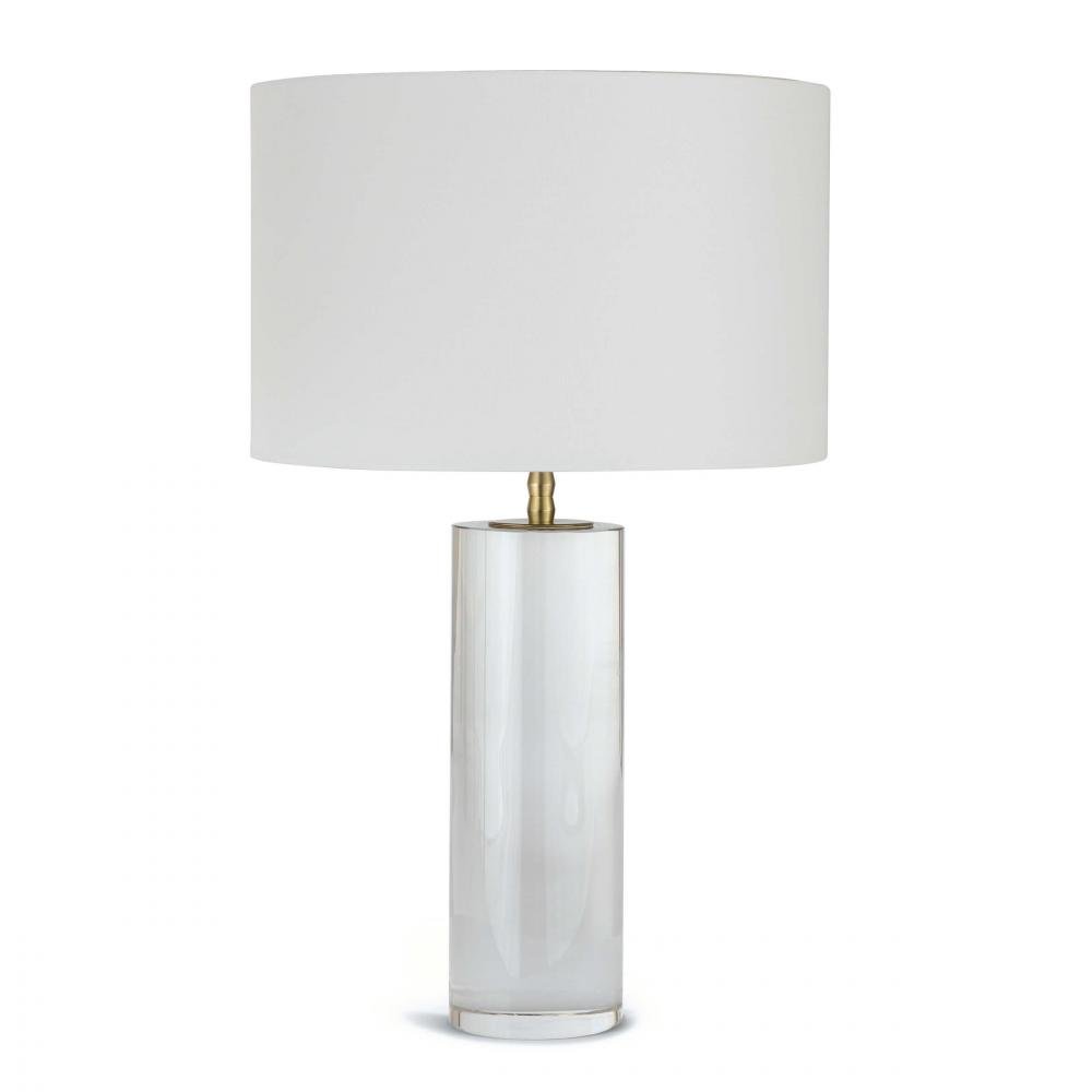
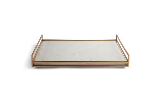
After finalizing the main pieces in the room, we layered in a large natural wood coffee table, additional side tables, table lamps with a subtle brass metal accent (for proper illumination during those dreary winter months), storage bins, accessories, and throws. We even added a special piece of artwork above the main sofa which perfectly tied all the various shades of blue in the room together. Little details such as two small square photographs of scenes from Greece reflect the clients’ recent travels. With the finishing touches like drapery treatments by our favorite (The Shade Store), a touch of flowers, some good coffee table books, and a decorative bowl or two for entertaining, we turned this to-do into a ta-da!
YOUR VISION, REALIZED
That realization of your refreshed space is what we live for. No matter what hurdles you may see laid before, we have the eye and expertise to bring a reinvented design to your home. We would love the opportunity to design your next space, whether you are local to the Florida area, or living in the big apple. We are currently accepting clients for our interior design services. Don’t feel like you have to just make it and try to get by another day. Navigate your day-to-day in a well thought out and purposeful dwelling that serves you and your family to the fullest. Feel free to reach out to our team at info@akco.design to find out how we can help.
Looking forward to connecting with you!


