E-Design: The Little Prince
In honor of my son’s second birthday this month, I thought it would be fun to feature a recent nursery e-design we worked on for a soon to be mama looking for a subtle take on the classic book “The Little Prince” by Antoine de Saint-Exupéry. Designing your baby’s nursery while navigating pregnancy can often seem like a fun idea, but more often than not, I see so many expecting mamas (including myself) becoming unnecessarily stressed by the amount of products, Pinterest images, and baby furniture that exists in the world today. This is one area of design in particular that we here at AK&CO. advise any first-time parent, or even one who’s looking to transition from a nursery to a toddler room, to seek out some interior design help!
Between performance friendly fabrics, or selecting pieces that will offer durability and transition seamlessly into a bigger kids room - we have been through it all and have the insight and experience to guide you away from the Pinterest time warp, and closer towards your photo-ready nursery room.
Our team (myself in particular) was excited to get going on this space and start alleviating the stress this soon-to-be-mama was feeling. The pressure was on, especially with the looming due date drawing near! So as with all our e-design projects, we quickly hopped on a call to discuss the vision the client had for the room. We also took the opportunity to go over Pinterest images the client thought aligned best with her style and desires. We then went back to the drawing board, developed a general floor plan, and honed in on the design elements and principles that were consistent among the client’s Pinterest images.
The result: A space that was calming, durable, safe for baby to grow and play, and offered smart and chic storage solutions.
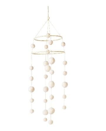
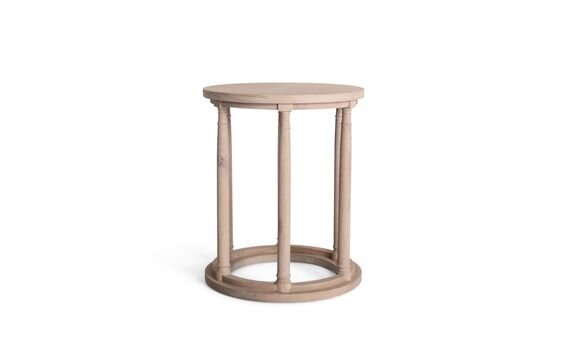
The image above is the overall vision we created for our Little Prince client; a soft color palette that offered subtle touches of brass to blend with the contemporary architecture of their new home, a convertible bed and dresser for baby to grow with and into, as well as ample bins to accommodate storage for dirty bibs, blankets, playmats and eventually all of those bright colored toys.
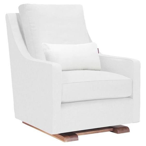
When developing a nursery (or any space that might need to accommodate babies, children or pets) we always look to incorporate performance fabrics wherever possible. This Como Glider by Monte Design not only comes in a white performance microsuede fabric, but the cushions themselves are removable and washable! The foam is also free of any flame retardant chemicals, phthalates, heavy metals or formaldehyde, which is an A++ in this mama’s book. If you don’t know why these products are unsafe for your children or you’d like to talk about what to look for in more detail, please drop us a comment in the box below, I would be more than happy to share my insight and research gleaned while studying orphanage design and how an interior space can heavily impact a child’s health and wellbeing!
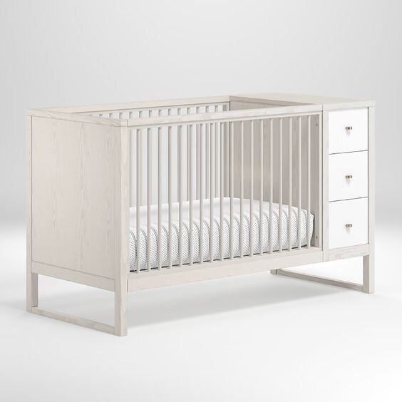
Now for the Crib and Dresser | The Two Key Elements Required in a Nursery Outside of the Rocker!
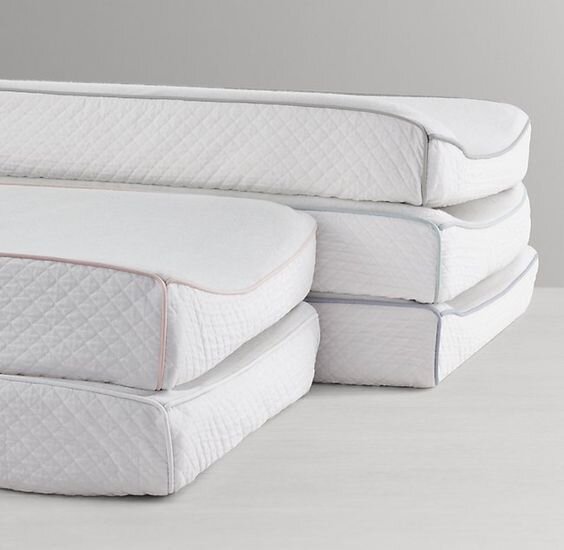
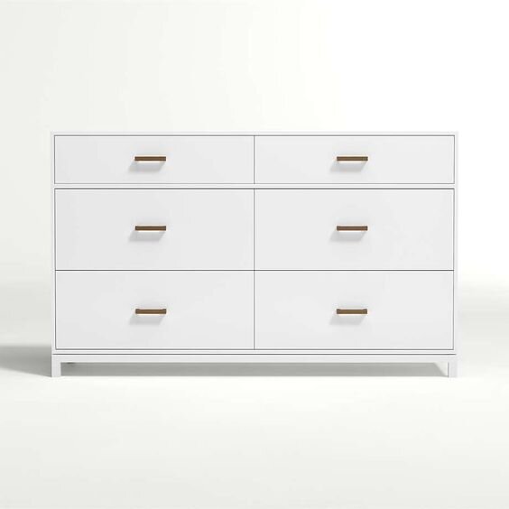
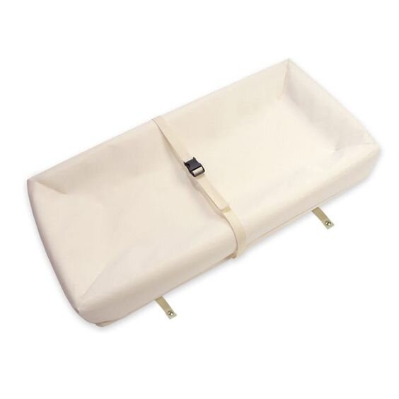
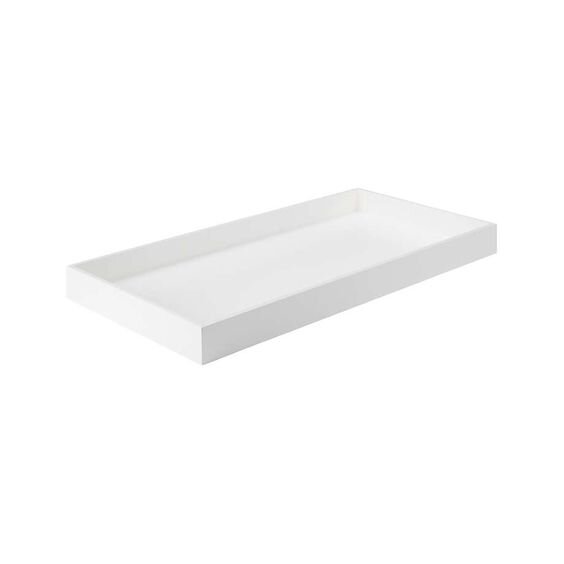
The pieces we specified in this design are great because of two key reasons. 1) they both offer flexibility as baby grows, and 2) they were both fabricated with low emission engineered wood (Again, let’s chat if you want more insight on why this is a requirement in our office!). When looking at baby furniture - specifically dressers and cribs, I always encourage my clients to purchase a dresser that has a removable changing table topper, and to look for a crib that comes with a toddler conversion kit! (Word to the wise, include that toddler conversion kit and rail on your registry instead of waiting to buy it at a later date to mitigate finding yourself in a scenario where the piece has been discontinued!) What’s also great about this crib is its extra storage on the right-hand side both as drawers, and as cubbies for storage cubes. This is great because it not only means you have additional storage space to quickly clean up when you have guests coming over to see baby, but you can also use this in the future as a place for your child to practice getting ready for the day by setting aside their clothes in one of the bottom drawers. This alleviates having them rummage through the main dresser until they are ready to start selecting their own clothes for the day!
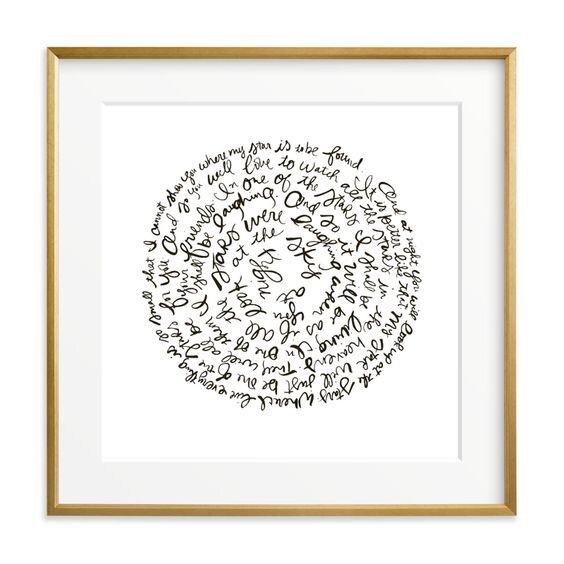
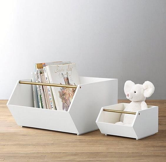
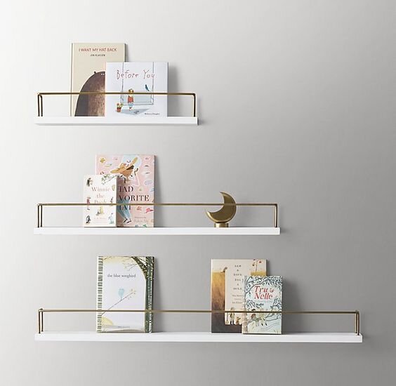
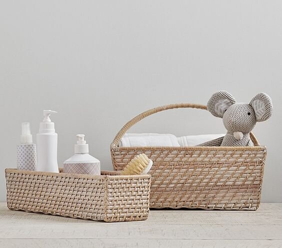
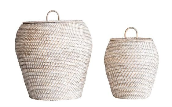
To round out the design, we selected a few additional storage items such as bins for toys to stack under the windows, wall-mounted shelves for display books/art, and a few extra rattan storage bins. Something unique we sourced for the client was this beautiful piece of art from Minted which actually showcases a quote from the book, “The Little Prince”. We love Minted for children’s art because you can quickly customize the art size, frame, border and matting, and even include the artist signature if desired! If you haven’t seen their latest collaborations or featured artists, you should check them out!
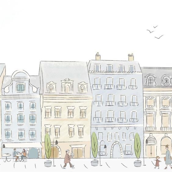
And last but not least, the piece that ties it all together - this Parisian Street wallpaper by Anewall! This was actually the first item we selected for this design, and we based all the other materials and colors around this feature wall. This wallpaper is great because it is pre-pasted, and HP PVC free! It also comes with a dry-adhesive on the back panels, so all you have to do is add water to activate when installing! We felt that this was the missing piece to the puzzle, and allowed the notion of “The Little Prince” to really come to life without acting as a theme in the room.
What do you think of this Parisian-inspired boys’ nursery? Are you currently expecting, or looking for someone to guide you towards your dream nursery room!? Feel free to drop us a comment in the box below, or reach out to our team at info@akco.design to schedule a complimentary consultation!
Sending so much love to all of our mamas today 🤍 Happy Thursday, friends!


